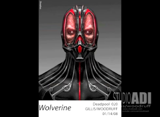
See What Deadpool Almost Looked Like in X-MEN ORIGINS: WOLVERINE by Alec Gillis and Tom Woodruff Jr.
Studio ADI released a video showing a bunch of concept art images of what Wade "Deadpool" Wilson (Ryan Reynolds) could have looked like in X-Men Origins: Wolverine (2009). Some are weird, and some are bizarre, but all are brilliant.
Check out the rest of the images after the jump and click to enlarge.
They describe the video this way:
"Here, in quick succession, are 82 variations on Deadpool. It was our job to satisfy the many creative voices on the show, from director Gavin Hood to the Producers and Studio, so we generated a huge selection of artwork from complete direction changes to subtle variations like tweaks to eye color. This is why having a design phase at the start of preproduction is so valuable. We'll never satisfy everyone with a design, but an exploratory like this lets us consider the options."
The designs are by special makeup effects designers and Studio ADI founders Alec Gillis and Tom Woodruff Jr.
Here are some stills from the video and what the finished make-up looked like.
Deadpool movie images by xmenmovies.wikia.com
Official Synopsis:
Heroic Hugh Jackman breathes the fire into Wolverine -- with a vengeance! This pulse-pounding action thriller sinks razor-sharp adamantium claws into the mysterious origins of Logan/Wolverine: his epically violent and romantic past, his complex relationship with Victor Creed/Sabretooth (Liev Schreiber), and the ominous Weapon X program that unleashes his primal fury.
See more of their work and videos from Studio ADI on YouTube and StudioADI.com.
Do you think the movie would have been different with one of these designs? What do you think of the illustrations?
@ Copyright 2009 Twentieth Century Fox Film Corporation, Marvel Enterprises, Dune Entertainment. All rights reserved


Wow, you wouldn't even know it was Reynolds under all of that.
ReplyDeleteDeadpool,being a parody of Spider-Man,talks to friggin much,so ok,if he seems to have no mouth?how does he talk?Or am I missing something?
ReplyDeletei think they did a horrible job. not only with how he looked but his back story in general. They merely skimmed the surface and failed to depict (and totally changed) CRUCIAL information and characteristics of wade's back-story.
ReplyDeleteWhile i'm happy Deadpool made it to the big screen, I hardly think it's deadpool at all. How do you remove the MOUTH from "The Merc WITH A MOUTH"?! I don't get it.
It's Wade "Deadpool" Wilson, not Williams....
ReplyDeleteFixed! Thanks Rob
ReplyDeleteGood lord, those designs are cool but freaky. The hairy one is nightmare fuel. The one with the skin peeled away from the eyes is an interesting interpretation of Deadpool's mask by way of Hellraiser. None of them really look like Deadpool, though. I understand they were trying to fill the studio's wishes and the designs are awesome with what they came up with, but I prefer the movie version, which I didn't care for either
ReplyDelete