 Concept artist Craig Shoji has posted some illustrations he did for the hit film Men In Black III (2012) on his website.
Here's what Craig told me about working on Men In Black III.
It was another really fun dynamic working with the same creative team as THOR and since most of us transitioned straight on to MIB3, there wasn't really a lull in the chemistry and productive momentum. However, this time it was much more quirky 1969 and 2012 'alien' spaces instead of Norse, god-like 'alien' spaces.
The film went through a host of script changes and the art reflects that. For example, in one version, the jailbreak in the beginning had "Boris the Animal" (named "Boris the Biker" in the script) and his girlfriend "Devil Girl" escape from prison and travel back in time together. Apparently, there were scenes set at the World's Fair and a morgue at MIB headquarters.
Craig cleared this up:
Q: This movie kind of establishes the '50s feel for the MIB headquarters. What was it like designing that?
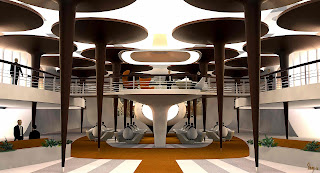
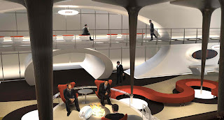
It was a lot of fun to work on the '69 headquarters design. In the previous headquarter designs from the past movies, they referenced Eero Saarinen's furniture styling with the shape of the stem and base of his tables and also established the look of the mirrored row of chrome columns running down the walkway. When playing with these motifs for a more appropriate 60s feel we embraced the idea that the best architects of the era (Frank Lloyd Wright) had helped contribute to the space. This led to creating the lily pad columns similar to what he used in the Johnson Wax building. It worked out well cause these kept the older aesthetic motif of those iconic columns in the 2012 model and previous headquarters, as well as provided a light source and great graphic visual for the ceiling space.A lot of other fun shapes we were playing with were smoothed out beveled rectangles in place of a lot of the ellipsoid and circular shapes in the 2012 version. This carried through the whole headquarters from screens, to windows, to walls and even the graphic pattern of the carpet.
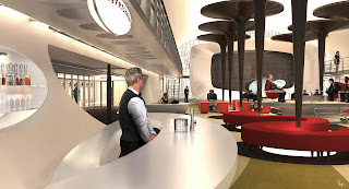
There were some great 'mad men' brainstorm moments where we thought 'why wouldn't they have a bar in the middle of the headquarters? It would be great to see all the agents and aliens grabbing a scotch together so casually as they did in the 60s. So in a couple concepts I included that space in the headquarters, though I don't think it ever made it into the movie. :)
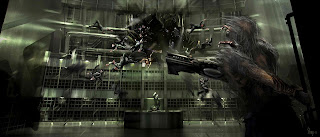
Q: The LunarMAX prison has shots of Boris "The Animal," but he looks very different. Were these early designs or just your interpretation from the script?
There was an early design for Boris from Rick Baker's team that I was referencing for that shot. It was before they settled on the prison garb, and refined all the finger-esque claws on him. I was responsible for illustrating the scene from the script when Boris blasts the hole in the prison and everyone flies out, but the details of how he 'clamps' down on the floor weren't worked out yet.
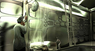
Q: There are two scenes I didn't see in the movie. Could you tell me about the "morgue" and World's Fair scenes?
Ah yeah, there were a couple scenes that didn't make it. I think Barry decided they slowed the pace down too much. There were a couple scenes written in where Will and Josh spend more time in 1969 in these different sets (galaxarium, and the morgue) digging up more info on Boris and his plans, but they got axed.
The World's Fair image is the wall mural that was used in the 1969 and 2012 headquarters. I was responsible for the design of that and putting a package together to be printed out at full scale. It was a great graphic break from all the interior designs, although it taxed my computer to the max with the file size.
First, LunarMAX prison for "Boris The Animal" (Jemaine Clement).
MIB Headquarters
Galaxarium
Jet Pack Station
A deleted scene in the MIB morgue circa 1969
These are from MIB headquarters circa 1969
"The Shack"
There's a lot more to see, so head over to Craig Shoji's work at pensketch.com
What do you think of the concept designs?







thank you... i told you this is just the coolest site. great, great chat.
ReplyDeleteThanks Jeremy. The guy is pretty interesting.
ReplyDelete